Sorrel & Sage Branding

Sorrel & Sage Branding
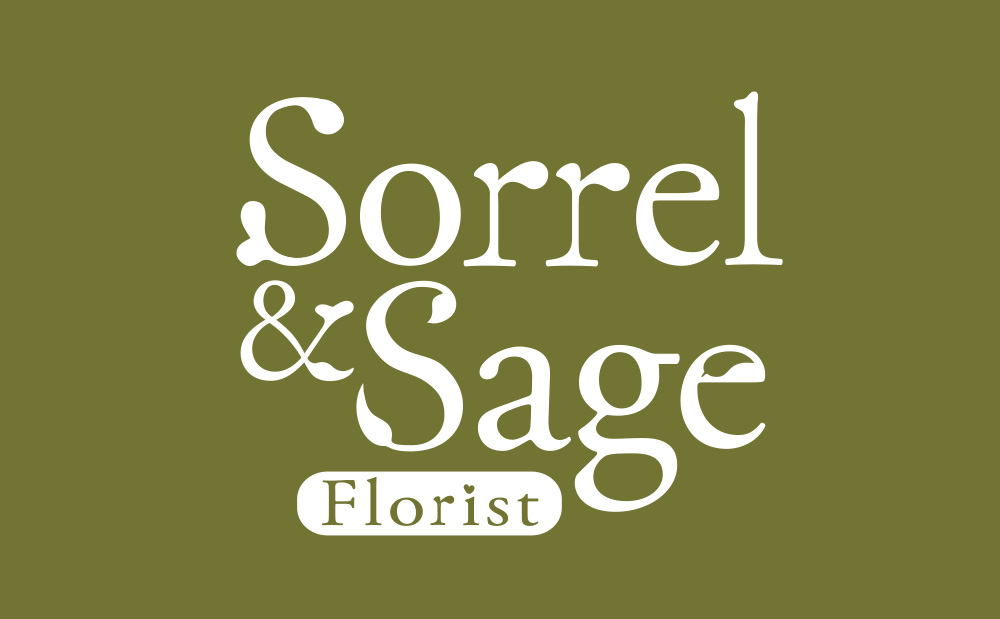
Sorrel & Sage stacked logo

Sorrel & Sage Brand ID

The Sorrel & Sage brand identity beautifully captures both their artisan style and rural location. It perfectly reflects their creative talents, love for country-style floristry, and approachable nature.

Discovery

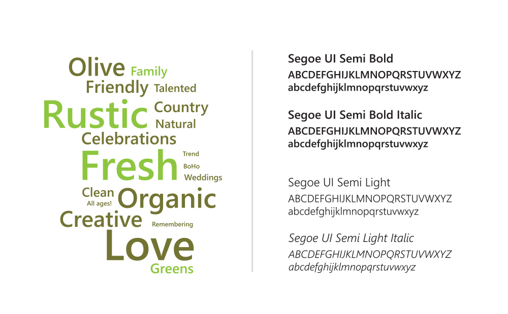
Based in a rural barn, Sorrel & Sage wanted a flexible brand identity they could easily work with themselves. During the discovery stage, we chose key words to describe the feelings they wanted the brand identity to portray. As creative professionals, they needed a premium online presence and fresh social media imagery to attract couples planning barn, tipi, and woodland weddings. They required a visual style that they could easily adapt and style over time.

The Brief

concept-board-type-faces-for-florist-shop

The Solution

The Logo & Brand Identity

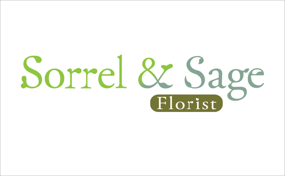
Organic colours and real foliage inspired the Sorrel & Sage logo design. Look closely and you will see natural leaf details embedded within the unique lettering strokes. I deliberately downplayed the 'Florist' badge at the bottom. This intentional strategy ensures the brand can drop the tag once consumers become familiar with the name. To match their warm, approachable nature, a small heart subtly dots the lowercase 'i'.

I created the logo in different formats and sizes to fit their website, stationery, and social media templates. For their shop window, I designed a more elaborate version that looks beautiful at a large scale.
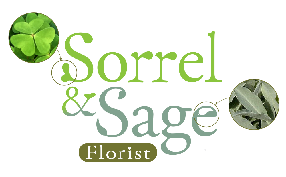
Infographic highlighting the serifs on the Lettering which were inspired by the shape of the sorrel and sage leaves.
sorrel-and-sage-logo
Logo design for Sorrel and Sage

Brand Photography

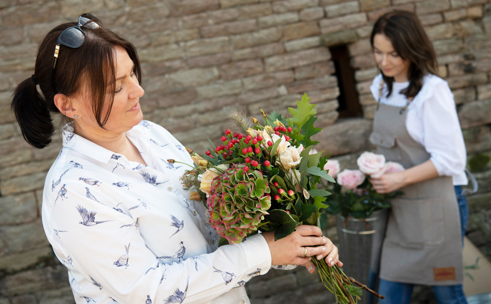
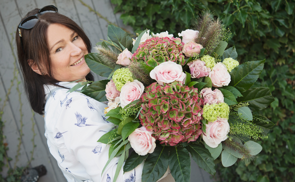
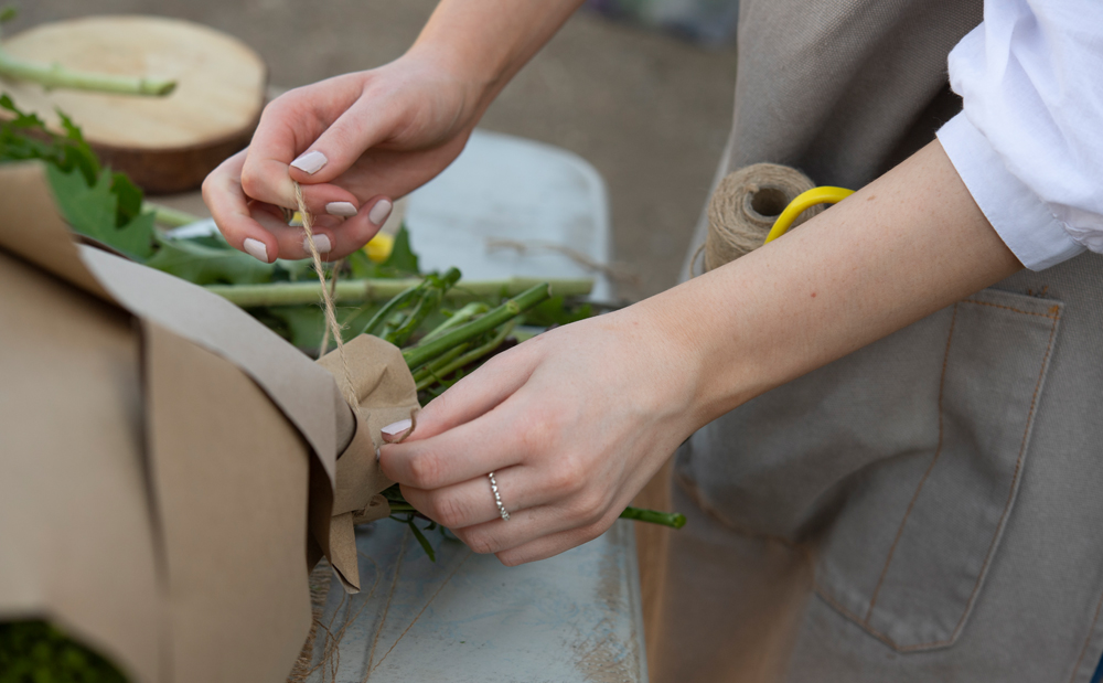
I captured a collection of natural portraits to reflects their rustic style and close family bond. During the photo shoot, I taught the team how to stage and capture their own work. This hands on training helped them create new social media images afterwards. We also left plain areas in the photography layout specifically for overlaid text.

I captured a collection of natural portraits to reflects their rustic style and close family bond. During the photo shoot, I taught the team how to stage and capture their own work. This hands on training helped them create new social media images afterwards. We also left plain areas in the photography layout specifically for overlaid text.

The Impact

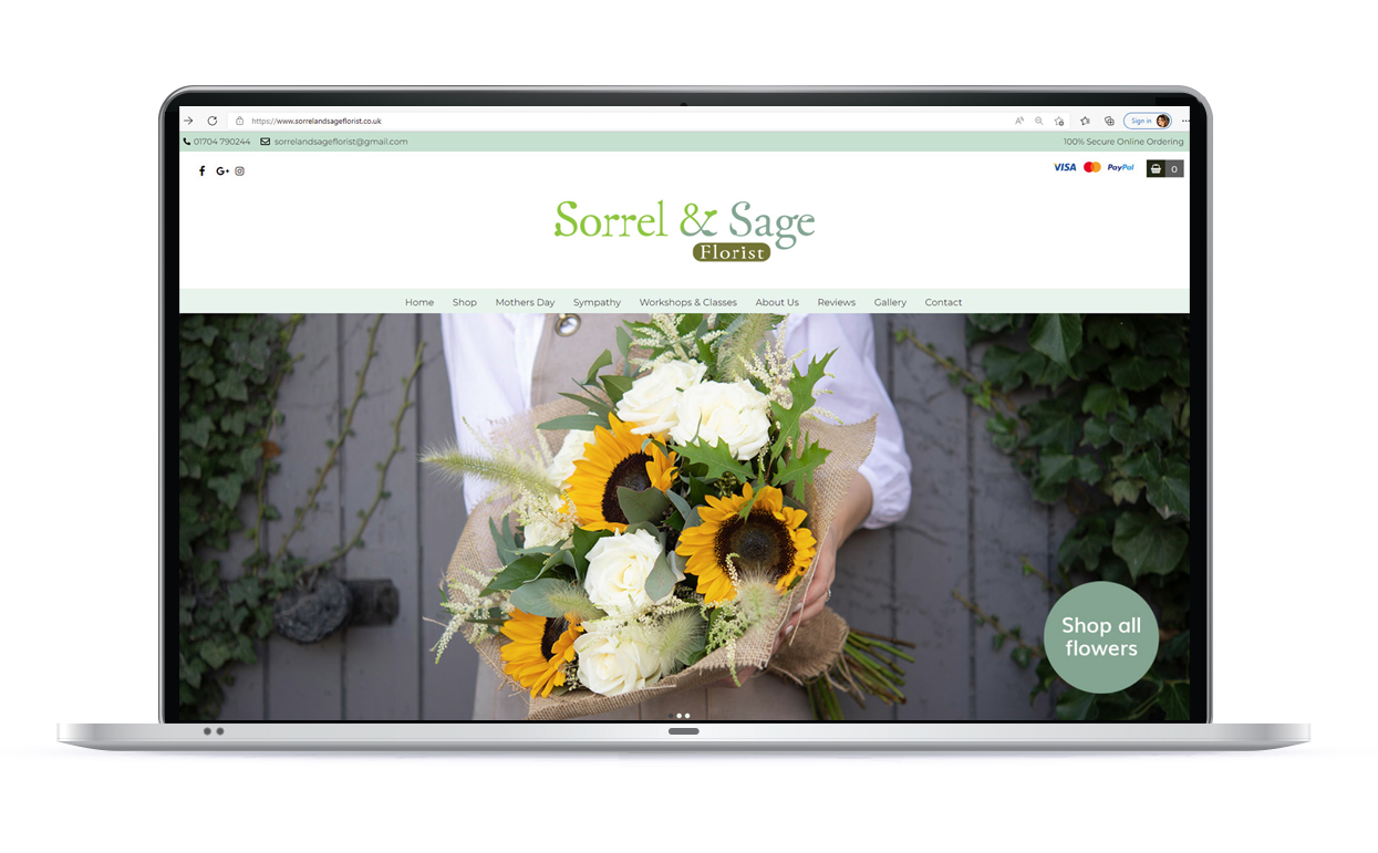
The brand identity and photography came together beautifully on the new website, which was built by a web design agency sourced by my clients. It showcases their rustic style, approachable nature and fresh floral arrangements. By providing them with a toolkit and photography tips they are fully equipped to manage social media. I thoroughly enjoyed working with Sorrel and Sage and I wish them lots of success for the future.

Amanda worked with us to create our branding, it was a pleasure to work with someone so professional yet still personable. She took time to understand what we wanted, what we were aiming for and to understand our style. Amanda also spent a day with us taking images for our website and social media, the images were fabulous and have been perfect to use for marketing. She answered all our questions and helped guide us through a process that we had little prior experience of. Would recommend Amanda in a heartbeat, a truly lovely lady who is clearly passionate about what she does!
Sorrel and Sage Website. Logo and photography created by Amanda Dantuma
A brightly coloured call-to-action icon.

Let’s start with a free,

no obligation consultation.

07769 321499

amanda@dantumadesign.co.uk


    Privacy Overview

    This website uses cookies so that we can provide you with the best user experience possible. Cookie information is stored in your browser and performs functions such as recognising you when you return to our website and helping our team to understand which sections of the website you find most interesting and useful.