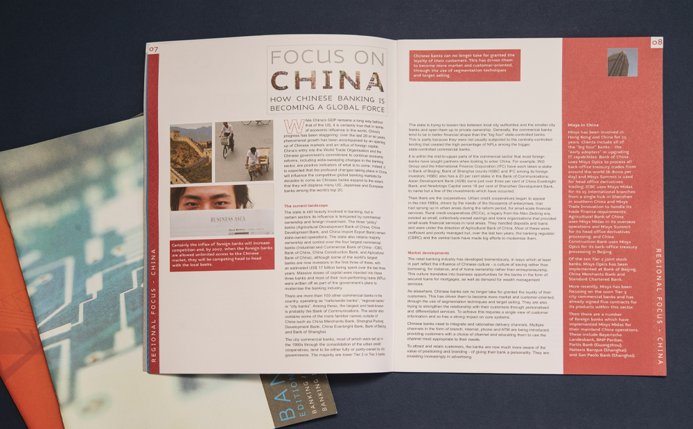
Banking Intelligence Newsletter
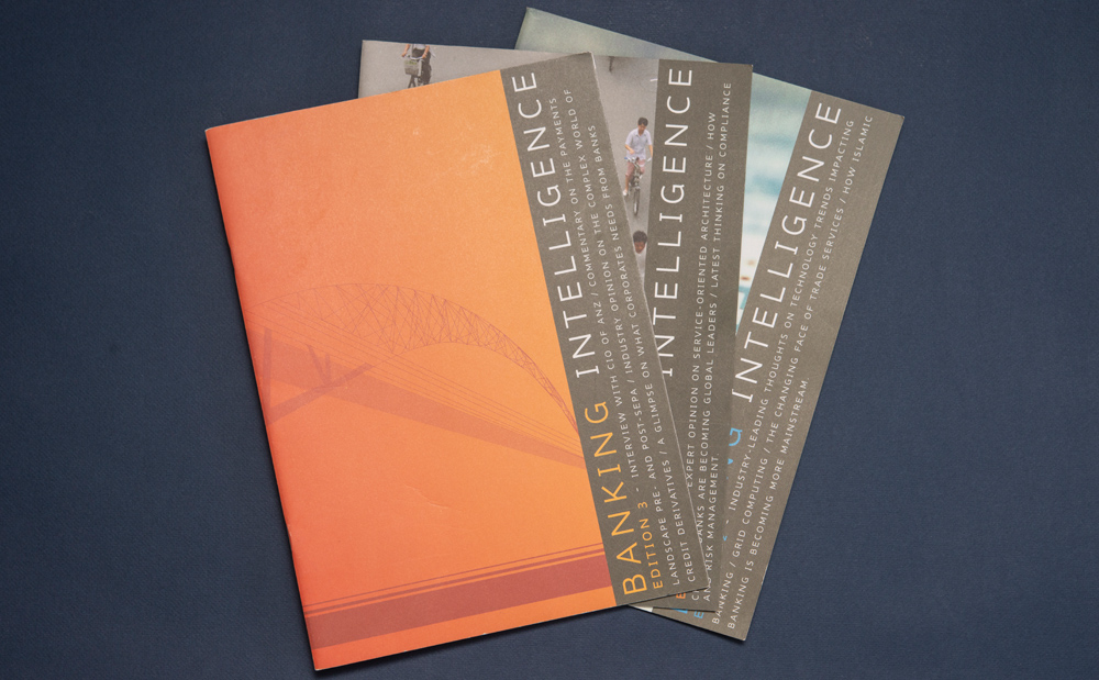
Banking Intelligence Newsletter with Editorial Illustrations
During my time at Misys, I created this award-winning editorial design and custom illustration series to bring complex data to life across a cohesive publication identity.
The Concept
Printing on uncoated stock not only highlighted the company’s green values but provided a tactile feel that separated the Newsletters from the glossy Misys brochures.
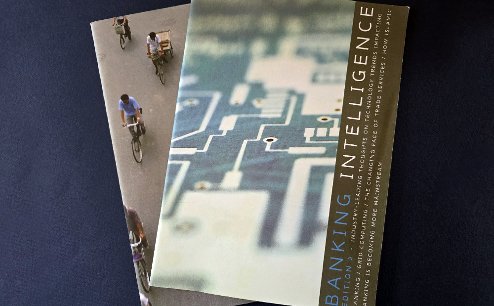
A right-hand sidebar layout directly on the cover provided a high-end feel that adapted seamlessly across the front covers.
To bring the pages to life, I created vector illustrations and infographics that made complex messaging much easier to digest. The design and illustrations ultimately won me the prestigious Misys Gold Award.
The Solution
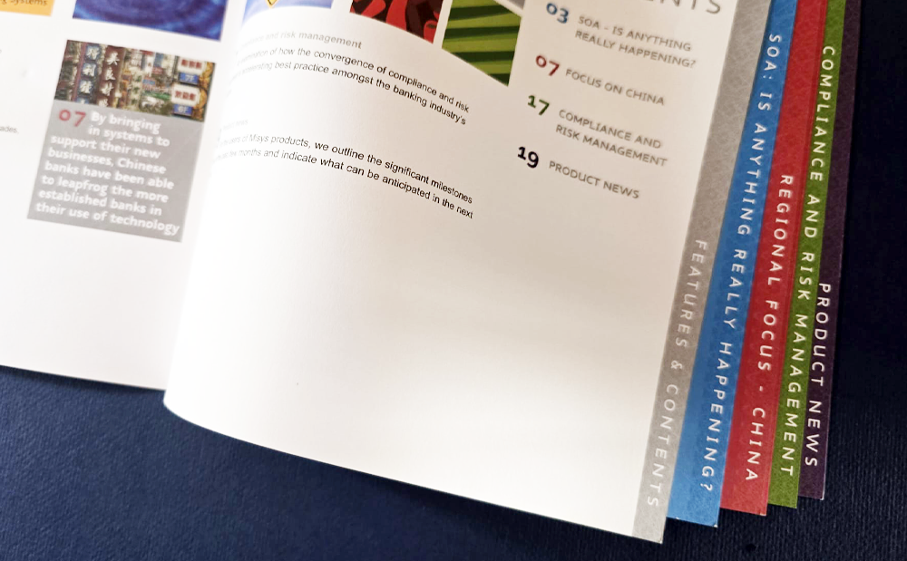
Navigation made easy
I color-coded the page edges so readers could easily flip to specific articles and features. The editorial layout retained the clean, modern look and feel that Misys liked, while incorporating custom infographics and illustrations to add visual interest.


Engaging Design for Complex Articles
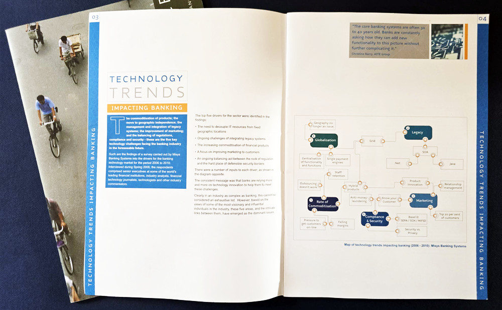
Inspiration can come from anywhere. For this project, an image of a computer switchboard set the tone for the entire layout. I took inspiration from that image to create a powerful infographic and supporting icons. This helped readers navigate the content and absorb more information.
Engaging Design for Complex Articles
Inspiration can come from anywhere. For this project, an image of a computer switchboard set the tone for the entire layout. I took inspiration from that image to create a powerful infographic and supporting icons. This helped readers navigate the content and absorb more information.